
Best wall art prints for living room updates usually come down to one thing, choosing pieces that fit your wall size and your furniture scale, not just prints you “like” on a screen.
A living room is where mismatched art shows fastest, too small above a sofa, colors that fight the rug, frames that look random, and suddenly the space feels unfinished even if everything else is nice.
This guide stays practical, how to pick print types that work in real homes, how to size and hang them, what to do if you rent, and what people commonly waste money on.
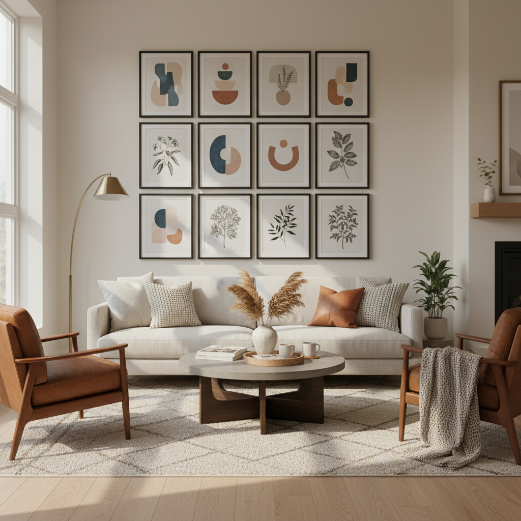
What actually makes a wall art print “best” for a living room
“Best” rarely means most expensive or most famous artist, it means the print supports how the room feels day to day. In many homes, the living room needs art that reads well from 6–12 feet away and holds up under changing light.
- Scale: The print should look intentional from across the room, not like a postcard floating on a big wall.
- Color relationship: It should echo 1–2 colors already in the room (rug, pillows, wood tone) without matching everything.
- Subject and mood: Calm abstracts, landscapes, or minimal photography often feel livable for shared spaces, while very busy art can tire people out.
- Finish and glare: Glossy can bounce light, matte often feels softer, especially near windows.
According to Smithsonian American Art Museum, art in the home can help shape meaning and identity in everyday spaces, which is a good reminder that “best” includes personal connection, not just trend alignment.
Quick self-check: which living room art direction fits your space?
If you feel stuck, don’t browse more, classify your room first. This tiny decision saves hours and keeps your cart from becoming a random mix.
A simple checklist
- You have neutral furniture (gray, beige, white, black): you can go bold on art, color fields, graphic prints, or saturated photography.
- You have a strong rug (pattern, lots of colors): choose quieter prints that repeat only one rug color, not all of them.
- Your room feels dark: lighter prints, high-key landscapes, soft abstract gradients, and lighter mats usually help.
- Your room feels cold (lots of gray/metal): warmer palettes, sepia photography, earthy abstracts, or wood frames can soften it.
- You’re renting or rearrange often: consider a gallery ledge or a flexible grid of same-size frames.
When people search for the best wall art prints for living room refreshes, they usually want an outcome that looks “pulled together” without redesigning the whole space, this checklist gets you there faster.
Popular print styles that work well in U.S. living rooms
Most living rooms can handle one “statement” and a few supporting pieces. These categories tend to work across many homes, even if your furniture is basic or inherited.
- Abstract (soft or geometric): Great for modern, transitional, and open-concept spaces because it doesn’t compete with everything else.
- Landscapes and coastal: Easy to live with, often calming, and pairs well with natural textures like linen, oak, rattan.
- Architectural and city photography: Strong lines look good in contemporary rooms, just watch glare and contrast.
- Botanical and nature illustrations: Friendly for family rooms, also pairs nicely with plants.
- Typography: Use sparingly, one piece can be charming, several can start to feel like a café wall.
A helpful rule: if your living room already has “visual noise” (patterned rug, open shelving, kids’ stuff), choose prints with more negative space.
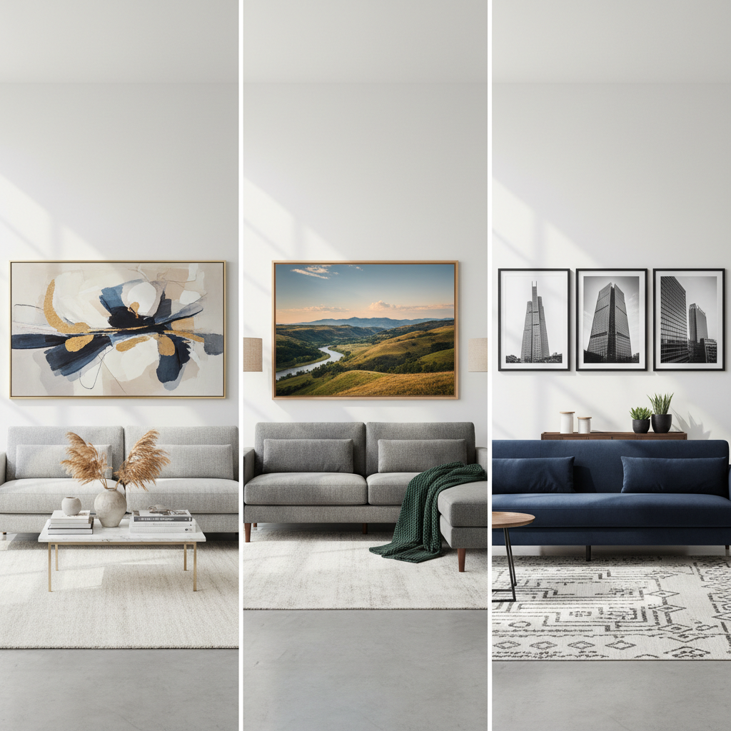
Sizing and placement: the part most people get wrong
Even the best wall art prints for living room styling can look off if the sizing is timid. Most “it looks weird” problems are really “it’s too small” problems.
Fast sizing guidelines (work for most rooms)
- Above a sofa: aim for art that spans about 2/3 to 3/4 of the sofa width.
- Single large piece: 24x36, 30x40, and 36x48 inches are common “statement” sizes, but measure your wall first.
- Gallery wall: treat the full arrangement as one big rectangle, plan the outer dimensions, then fill in.
- Hanging height: many designers target eye level around 57–60 inches to center, but adjust if you have tall ceilings or low seating.
If you want the room to feel taller, hang slightly higher and use vertical pieces, if you want it calmer, keep the top line of frames more consistent.
Mini table: common living room setups
| Wall situation | What usually works | What often looks off |
|---|---|---|
| Over a standard sofa | One large print or 2-piece set with wide presence | One small frame centered with lots of empty wall |
| Narrow wall by a window | Vertical print or stacked pair | Wide panoramic that fights the window line |
| Fireplace wall | One bold piece or symmetrical pair | Busy gallery wall that competes with mantel decor |
| Open-plan living/dining | Repeating frame style across zones | Different styles that chop the space into pieces |
How to choose frames, mats, and finishes without overthinking
Print + frame is the real unit people see. You can buy beautiful prints and still end up with “college apartment energy” if the framing looks random.
- Frame color: black for crisp contrast, natural oak for warmth, white for airy rooms, brass for a softer glam note.
- Matting: a mat gives breathing room, especially for photography or smaller prints you want to feel elevated.
- Glass type: glare is real near windows, anti-reflective options can help, though cost varies by vendor.
- Finish: matte prints often feel calmer in living rooms, glossy can work if lighting is controlled.
If your goal is a cohesive set, keep frames consistent and vary art styles slightly, or do the opposite, consistent art style with a mix of frame widths, both can look intentional when done on purpose.
Practical room-by-room steps: from measuring to hanging
Here’s a workflow that tends to prevent “buy now, regret later.” It’s not fancy, but it works.
Step-by-step
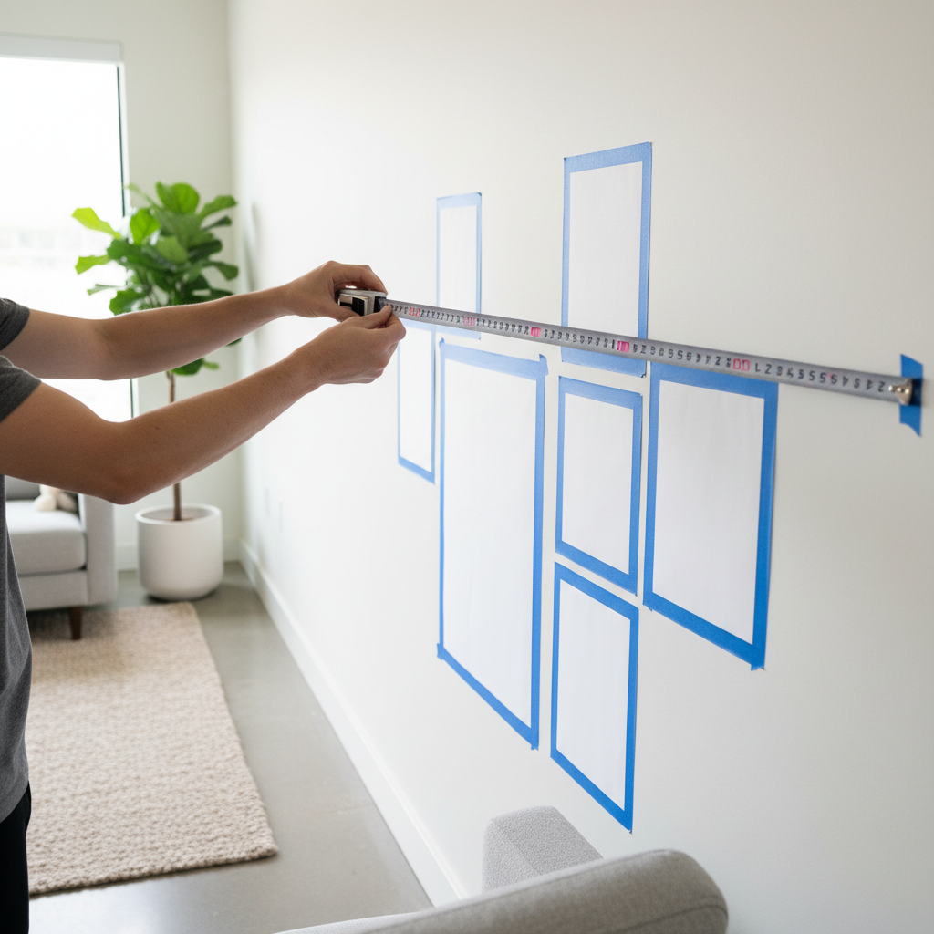
- Measure the wall zone you want to fill, not the whole wall, think “above sofa,” “between two windows,” “entry to living area.”
- Pick one anchor piece first (largest print or strongest image), then build around it with supporting prints.
- Choose a palette rule: repeat two colors from the room and allow one accent color only in the art.
- Mock it up with painter’s tape or paper templates, this step feels annoying, then saves you extra nail holes.
- Hang with consistent gaps, many people like 2–3 inches between frames in a gallery wall, but consistency matters more than the number.
According to U.S. General Services Administration (GSA), proper picture hanging involves selecting hardware rated for the wall type and load, in a home context that translates to using anchors when studs aren’t available and not guessing on weight.
Common mistakes to avoid (and what to do instead)
Some mistakes are so common they almost feel like a rite of passage. If you avoid these, your living room art will look more “finished” even on a reasonable budget.
- Buying before measuring: measure first, then shop by size range, not by vibes.
- Matching everything: if art matches the sofa and rug perfectly, it can look flat, aim for echo, not duplication.
- Too many focal points: one hero wall is usually enough, other walls can get smaller or calmer pieces.
- Ignoring lighting: a print that looks great at noon can feel muddy at night, check how it looks under your lamps.
- Hanging too high: if you feel like you need to tilt your head up, bring it down a bit.
If you already bought small prints and don’t want to rebuy, grouping them tightly into a gallery wall and adding mats can make them read as one larger statement.
When it’s worth getting professional help
Most people can handle print selection and basic placement, but a few situations benefit from a pro, even a one-hour consult.
- You have very high ceilings or a tricky staircase wall and can’t visualize scale.
- You’re mixing valuable original art with prints and want a cohesive plan.
- You need custom framing for unusual sizes or want museum-style results.
- You’re unsure about mounting safety on plaster, brick, or heavy frames, a handyman or installer may be appropriate.
For renters, it’s also reasonable to ask a local frame shop about lighter frames and safer hanging options, your walls, and your security deposit, will thank you.
Key takeaways (save this before you shop)
- Scale beats trend, size your art to the furniture, especially above a sofa.
- Pick a palette rule so prints relate to the room without matching everything.
- Frame choices matter, consistent framing can make affordable prints look elevated.
- Mockups prevent mistakes, tape templates cost little and save time.
Wrap-up: a simple way to decide your next purchase
If your living room feels unfinished, start by choosing one anchor piece at the right size, then let everything else support it. When you shop for the best wall art prints for living room spaces, you’re really shopping for balance, scale, and a mood you can live with.
Your next action can be small, measure the wall zone above your sofa today, then pick one print size range and only browse within it. That one constraint makes the whole process easier.
FAQ
What size wall art print looks right above a couch?
Many rooms look balanced when the art spans about two-thirds to three-quarters of the couch width, either as one large print or a grouped set. If you’re between sizes, going slightly larger often reads more intentional.
Should living room art match the rug exactly?
Exact matching can feel a bit “set-like.” A better approach is repeating one or two rug colors in the artwork while keeping the rest of the palette quieter, it ties the room together without looking forced.
Are canvas prints or paper prints better for a living room?
Canvas can feel softer and less reflective, which helps in bright rooms, while paper prints with mats often look more refined and gallery-like. The “better” choice depends on your lighting and whether you want a framed look.
How do I make cheap prints look expensive?
Use consistent frames, add mats when appropriate, and hang at a deliberate height with even spacing. Most “premium” looks come from presentation and scale, not just the image file.
What’s a safe way to hang prints in a rental?
Lightweight frames plus removable hanging strips can work in many cases, but wall paint and humidity vary, so test a small area first. For heavier pieces, consider a ledge shelf or ask a professional about safe anchors that minimize damage.
How many prints should be on one living room wall?
It depends on wall width and how busy the room already feels. A single large piece can be enough, while a gallery wall works when you commit to a clear outer shape and consistent spacing.
Where can I find art prints that won’t feel trendy next year?
Look for subjects you genuinely like living with, landscapes, architectural photography, simpler abstracts, and consider neutral framing. Trendiness often comes from very specific color fads, so keeping the palette grounded helps.
If you’re trying to update your living room quickly without turning it into a full redesign project, narrowing down your wall measurements and preferred print style first makes shopping far less chaotic, and if you want a more hands-off route, a curated set of coordinated prints and frames can save time while still looking intentional.